How to Make a Slick (no-code) Landing Page in Less than a Minute
Published on 06/29/23 by Billy Howell
Hi! After starting 10MinuteCMO I’ve become obsessed with No-Code tooling. ICYMI: you can read about 10MinuteCMO here.
The Tagline: Framer is excellent for quick prototyping and design inspiration
Background
Lately I’ve been playing around with Framer. Framer is a “zero code”, AI-powered website builder.
When I first saw Framer I was skeptical. My usual web design process is to prototype in Figma then build it out in Webflow, Bubble or Softr. And that stack works pretty well for me.
The Framer editor is no where near as customizable as Webflow and Bubble. And it doesn’t feel as intuitive as other apps. Want custom login flows or to connect your site to a database? Can’t do it.
Then I found the AI button.
The AI Button

Okay they didn’t exactly hide it, it’s the biggest thing on their landing page. Due to the AI-fication of every possible app my eyes sometimes glaze when I see AI features.
To start a website you type in a short prompt describing your business like “Owex Labs is an SEO and No-Code design agency” and then Framer generates a responsive homepage with hero sections. You can also generate additional pages, page sections and copy.
Examples
The design output is astounding. Here are some favorite landing page sections that I’ve generated:
![[Screen Shot 2023-07-19 at 6.11.27 PM.png]]
I’m totally going to use this for OwexLabs
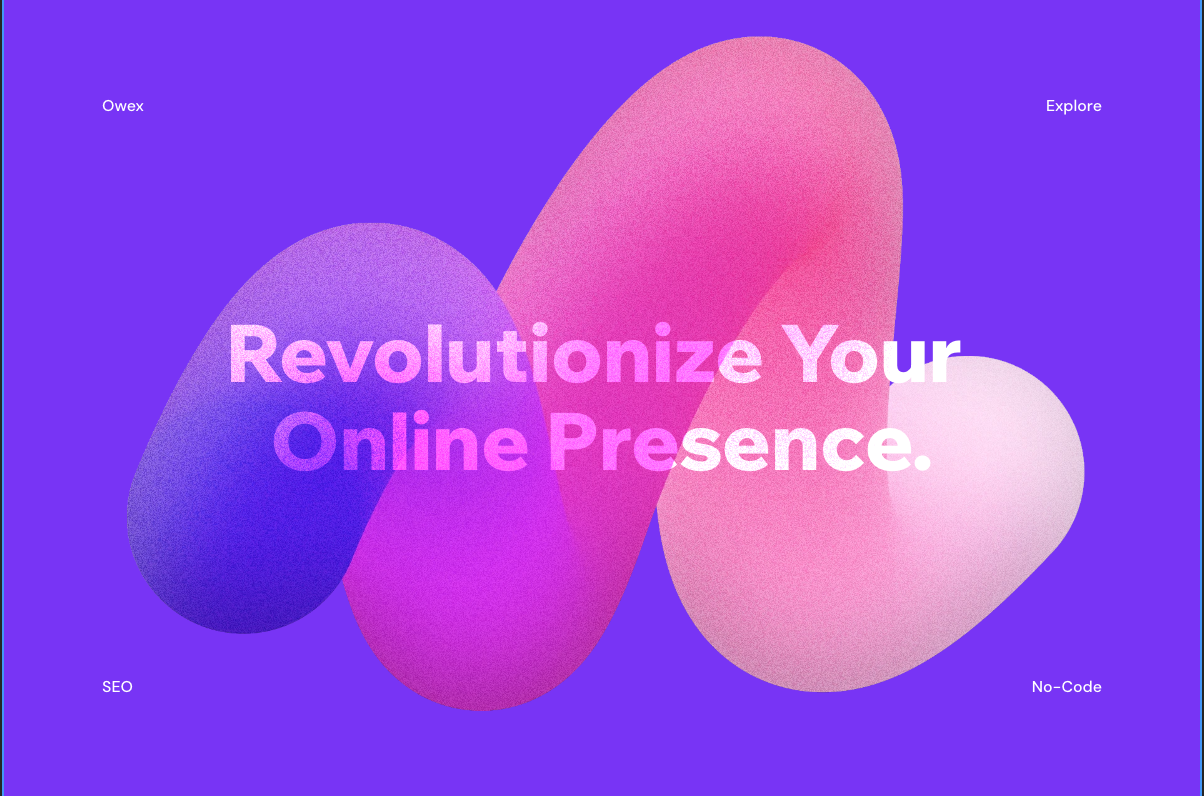 Pretty colors
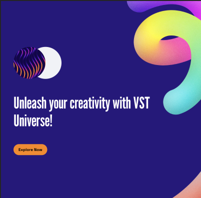
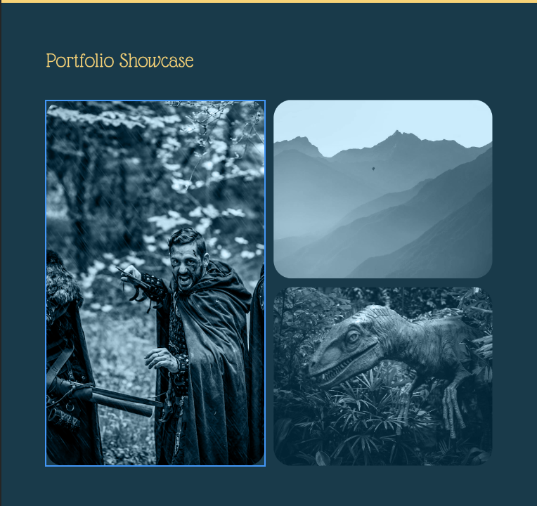
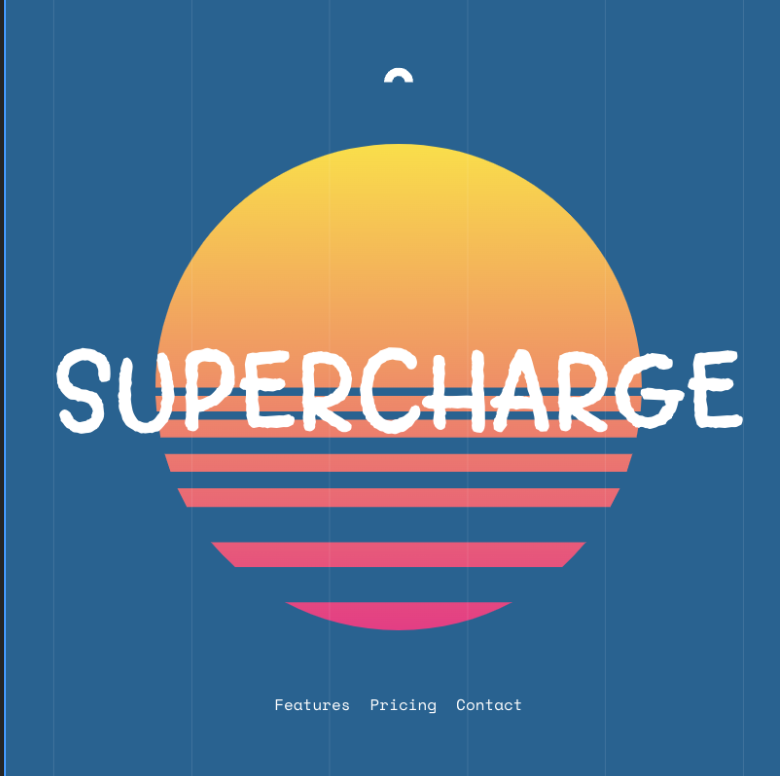
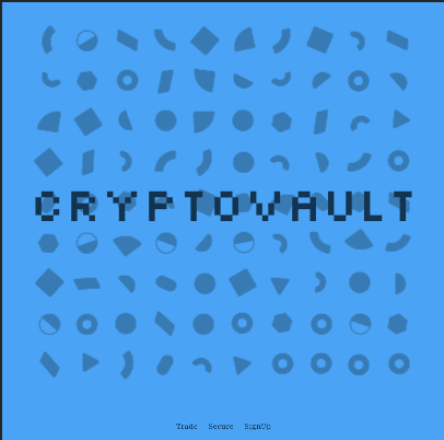
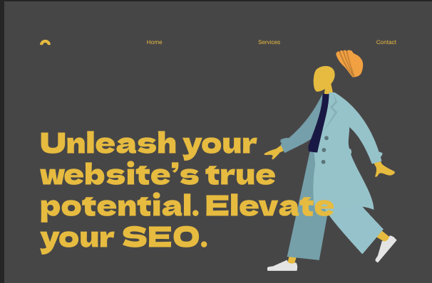
You can quickly shuffle through color templates too which is a big plus.
Features
The crazy thing is you can generate and publish unlimited pages in Framer for free. Custom domains are an absurdly low $5/month.
For $15 a month you can add a CMS section for a blog or programmatic Landing Pages. There’s also a cool SEO analytics dashboard for paid plans that I haven’t used yet.
The Bottomline
I probably won’t use Framer for every project’s final website. But I will use it for early site builds and I will continue to use it for design inspiration.
The designs are consistently great. They feel like I’m reading a lookbook instead of landing page copy. I love the maximalism of the designs. It stands out in a world of minimalist and brutalist design.
Thanks for reading
If you enjoyed this article and know someone who might also enjoy it please share it and/or sign up for my email list!
To learn more about my work I encourage you to read my 3 part series on Programmatic SEO (PSEO): Part 1 Part 2 Part 3
Written by Billy Howell
← Back to blog
